Build a brand style and assets with ChatGPT
Introduction
A brand’s visual identity is like its face to the world. In a crowded digital landscape, it’s what makes you memorable and sets the mood for every encounter—before anyone even reads a word.
Traditionally, building a strong visual brand took big budgets, designers, and a lot of trial and error. Now, with AI image generation, anyone can experiment, create, and refine a unique look—no art degree required.
This guide will walk you through building a brand look and feel with AI as your creative partner. Th
What You’ll Learn
- How to define your brand’s core vision and emotional tone
- How to use AI as a creative collaborator (not just a tool)
- How to develop a consistent style “system” and re-usable branding assets
- Tips to keep the human touch and evolve your style as you grow
Step 1 : Start with Vision & Feeling
Before you touch any design tools or AI, start with a clear vision. Imagine your brand as a character in a story:
- What do you stand for?
- What change are you trying to make?
- How do you want people to feel when they see your brand?
Your vision is the North Star—guiding every creative choice that follows.
Think of feeling as the “vibe” or atmosphere you want your audience to experience.
Do you want to feel bold and futuristic? Calm and wise? Playful and welcoming? Write it out, even in simple terms. This is your starting point.
Examples of Vision & Vibe for Different Brands
1. Modern Tech Startup
- Vision: Empower small businesses to work smarter with automation.
- Vibe: Bold, innovative, energetic.
- Keywords: Futuristic, high-contrast colors, dynamic lines, glowing highlights.
Brand description: “A bold, futuristic brand background. Use high-contrast, electric colors and dynamic geometric lines. The mood is energetic and innovative—like the future is happening right now.”
2. Mindfulness Coach
- Vision: Help people find calm and clarity in a noisy world.
- Vibe: Gentle, peaceful, supportive.
- Keywords: Soft pastel colors, organic shapes, light textures, minimal graphics.
Brand description: “A peaceful, calming scene in gentle pastels. Soft, organic shapes and subtle textures. The feeling is tranquil and supportive, like a safe, quiet space in a busy world.”
3. Indie Fashion Brand
- Vision: Make self-expression accessible to everyone.
- Vibe: Playful, confident, rebellious.
- Keywords: Vibrant colors, playful patterns, handwritten fonts, collage elements.
Brand description: “A playful, rebellious design with vibrant colors and collage-style elements. Handwritten details and bold patterns. The vibe is expressive, creative, and a little bit wild.”
For the purpose of this guide, we will use the Indie Fashion brand example and work with the theme described above.
3. Moodboard & Visual Planning
Once you know your vision, start collecting inspiration for a moodboard
A moodboard is just a collage of images, colors, patterns, and styles that “feel right.” You might grab:
- Screenshots from brands you admire
- Artworks, photography, textures, or even movie scenes
- Colors that evoke your brand’s feeling
This is like a painter gathering colors before making a masterpiece. You can gather images from websites or other sources on the internet. Be aware of copyrighting issues while using images from other brands. You can use them as a reference to build off of, be careful not to “copy” them.
You can also use AI for “visual brainstorming”—generating style options and narrowing down what fits. The point: get a sense of what resonates before you create your own images.
Lets try using AI to create a moodboard and style sheet with a few reference examples. We will use chatGPT 4.1 for this exercise.
Prompt :
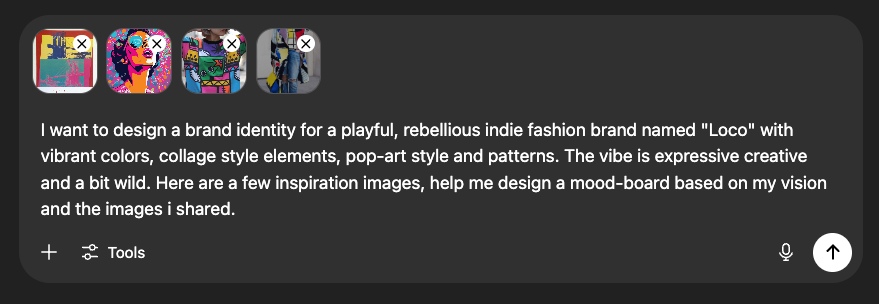
AI Response:
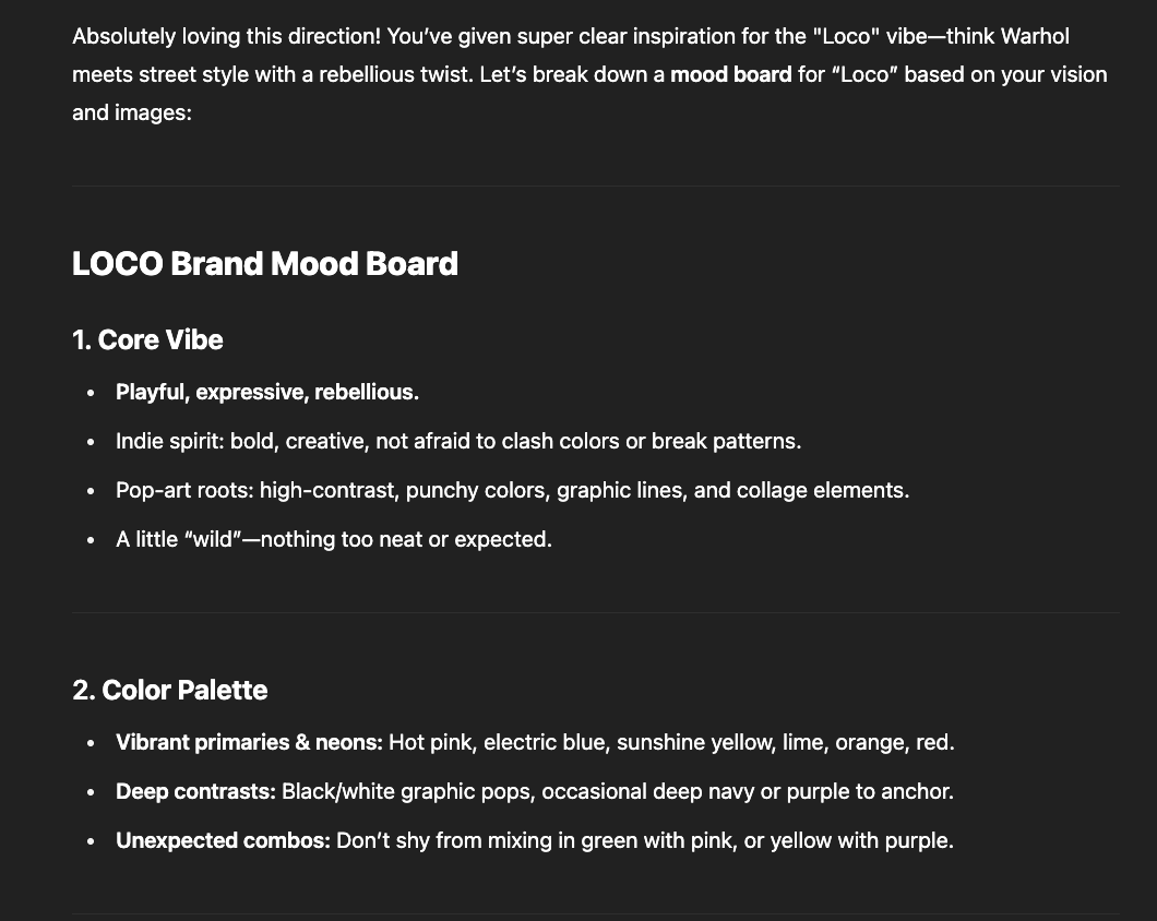
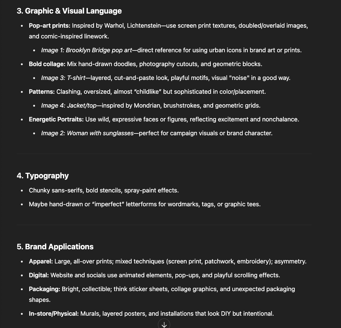
This Gives us a solid head-start and inspiration to start putting elements together. These elements, such as color palettes, fonts, visual language etc, will help define the image of the brand.
In the Next step, we will narrow this down to specific set of styles and elements we want to work with. Lets ask a followup question.
4. Collaborative Generation Process
Lets build off of the options suggested by 4.1 by asking followup questions. Think of yourself as a movie director, not just a scriptwriter. You set the scene; the AI helps bring it to life.
Prompt:
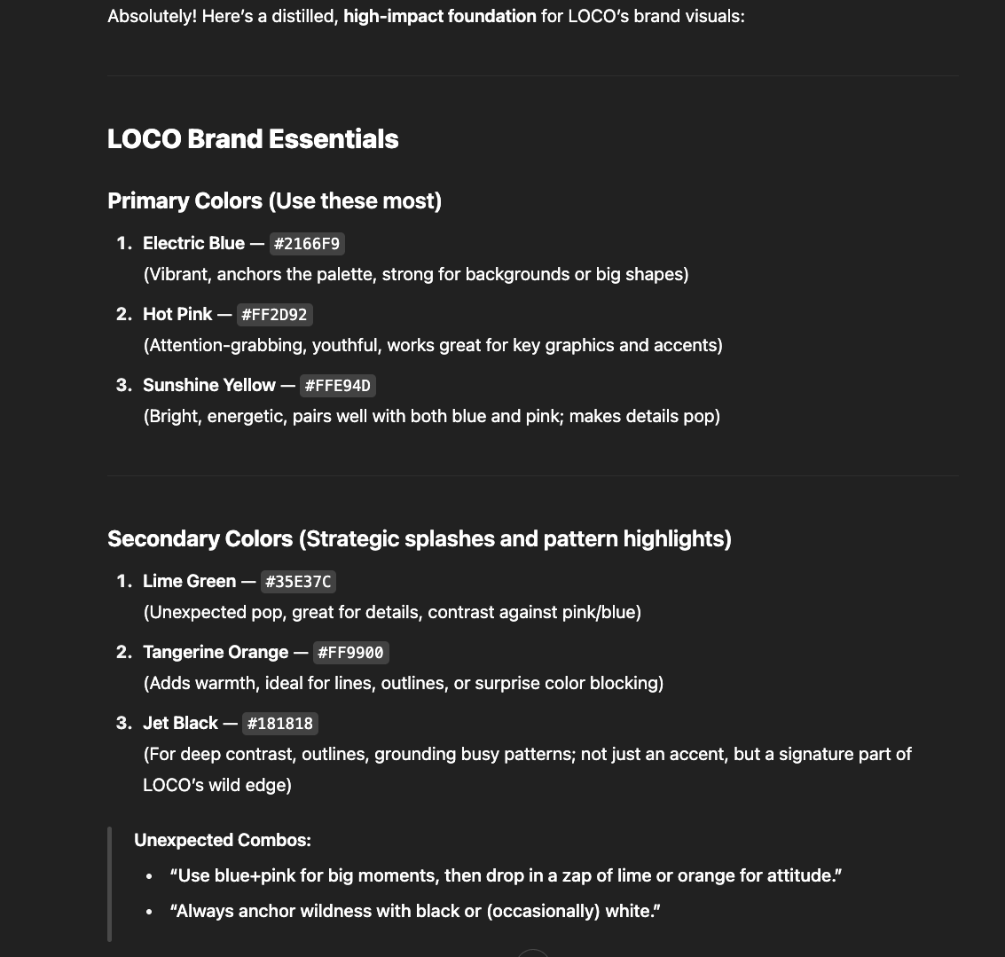
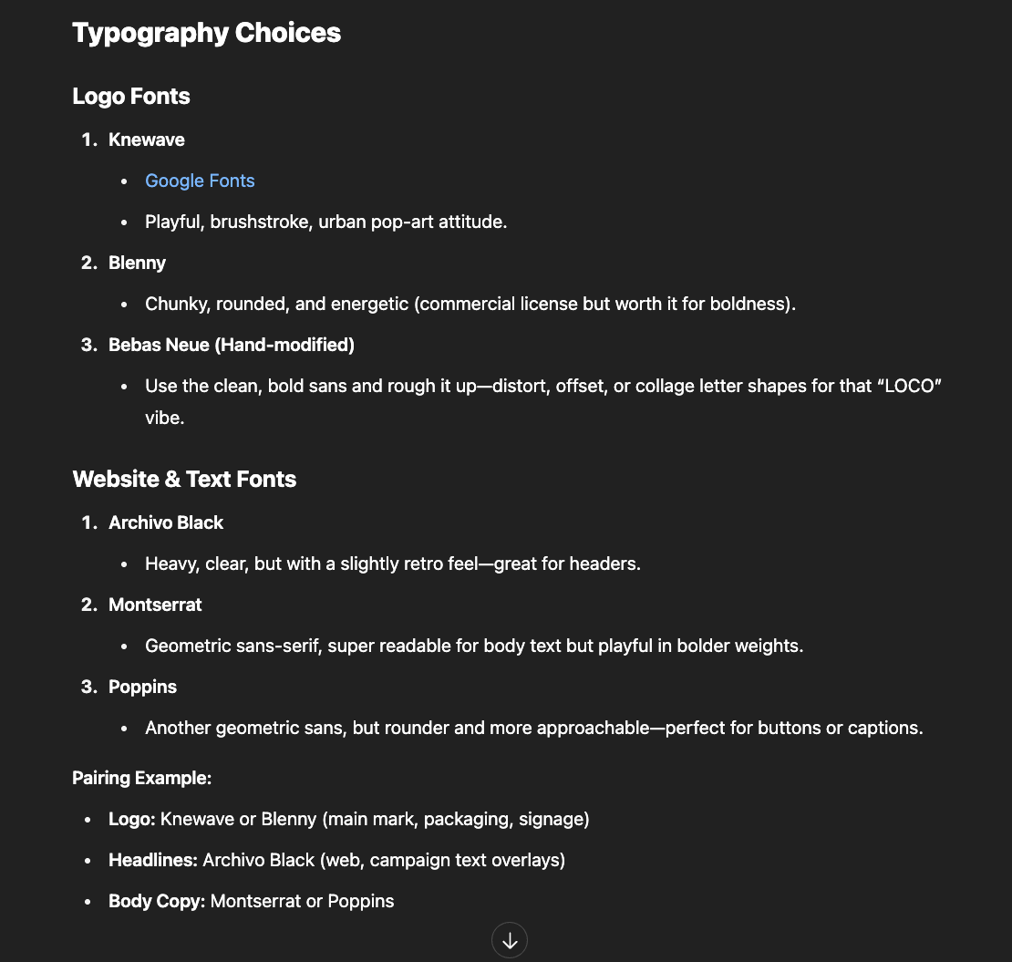
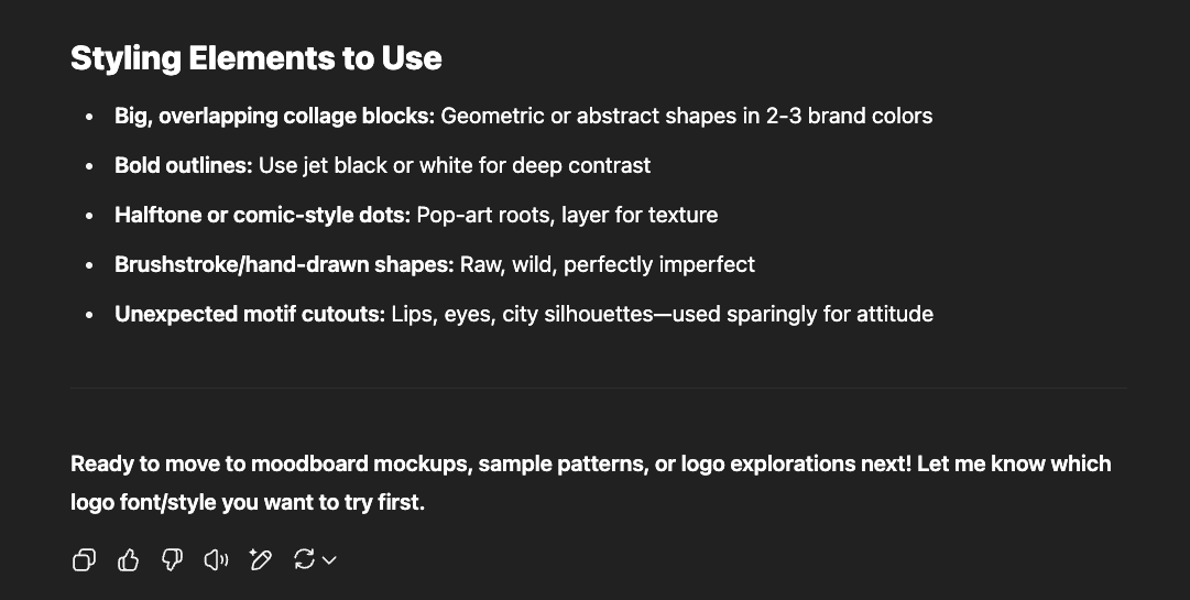
Let’s start by generating some logo options.
Prompt:
AI Response:
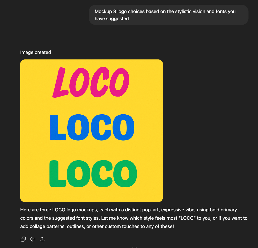
We’re making progress, it generates a few logo options to begin with. Pick a style you like and generate some reference images with different colors and styles.
Prompt:
AI Response:
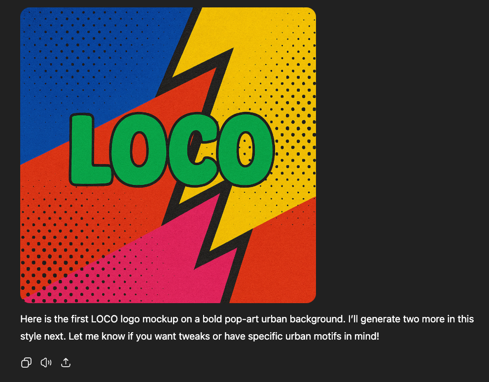
Ask it to generate different variations of the background, or even color of the logo. Pick out colors it suggested and try variations with it.
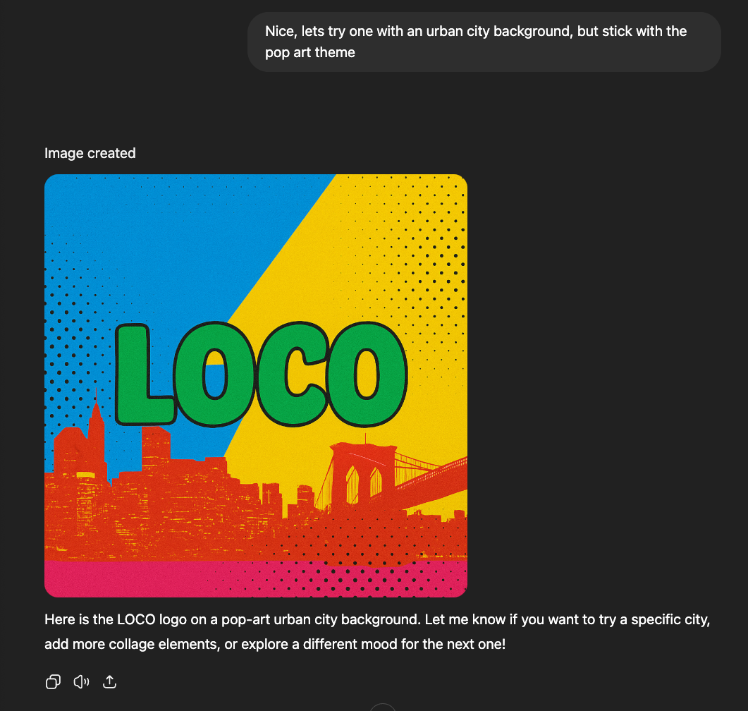
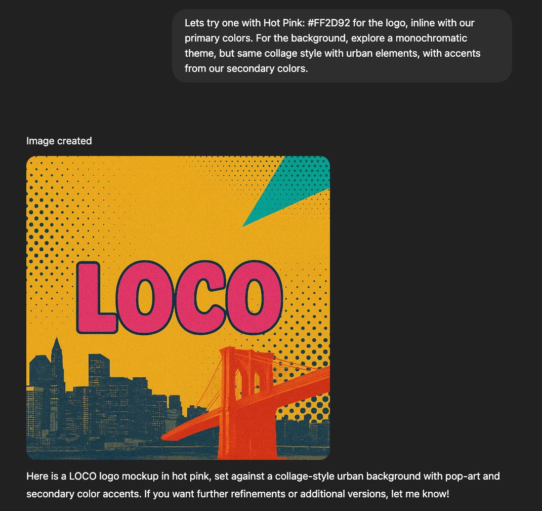
Now that we have a direction, lets document some settings, words, and approaches that give you the look you want. This will save time and keep your brand consistent later.
5. Establish Your Signature Brand System
Ask the AI to document key aesthetic, shapes, colors and patterns you want to preserve from the generated images and use them for further image generation.
- What colors, shapes, or patterns do you want to use most?
- Are there visual elements (grids, glows, motifs) that repeat across your posts?
- Is your style minimal or detailed? Bright or subdued? Figurative or abstract?
Remember, this is not your final design, these are elements that will be used in you final design to refine your digital assets.
Prompt:
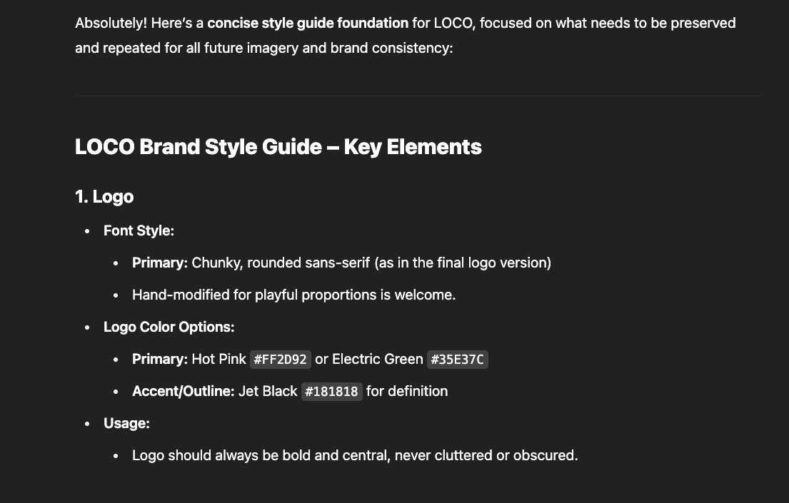
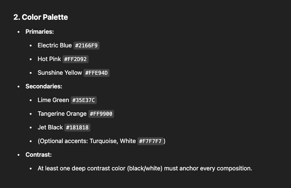
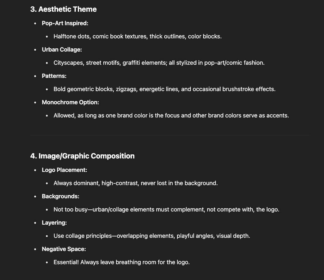
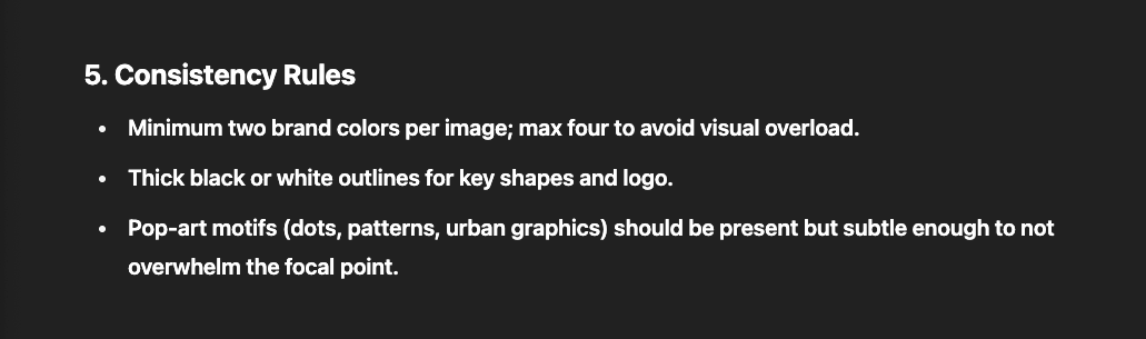
Systemizing these rules means you can create new content quickly, and your audience always knows when they’re seeing your brand—even out of the corner of their eye. By doing so, you are also establishing an understand of your vision with the AI.
Generate Social & Ad Image Mockups
Now that you have a signature visual system, it’s time to test how your brand could look “in the wild”—on social posts, profile banners, and ads.
Mockups help you preview and refine your style for real-world formats. This ensures your brand is recognizable and compelling wherever your audience meets you. These are not final images that will land on your social but they serve as inspiration images for your final product or branding design.
Decide on what features you would like in your mockups. For Ex:
Prompt:
AI Response:
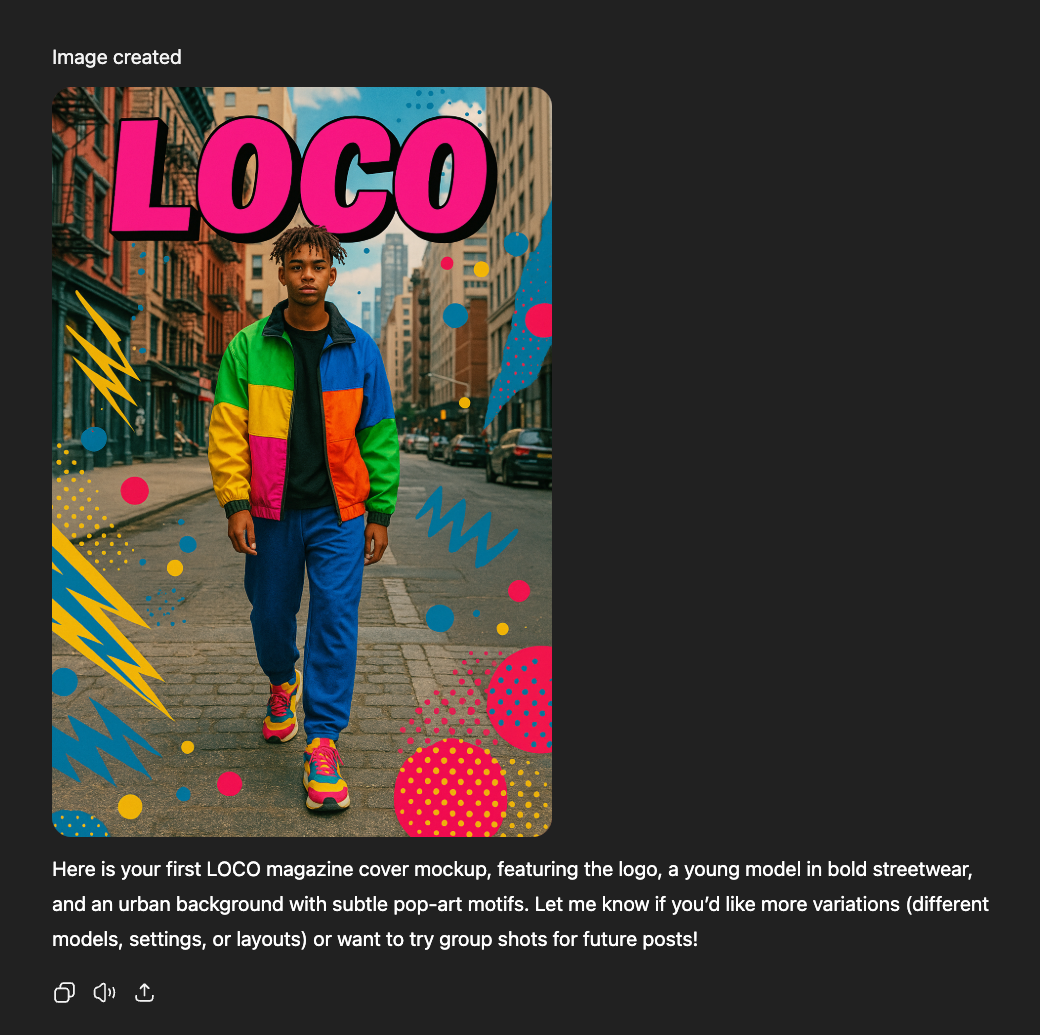
Continue with the process to experiment with more visual styles, for ex - different framing or placement, less or more aesthetic elements, different background designs and colors combinations.
Its important to continue to refine the elements that you like and remove the ones that you don’t.
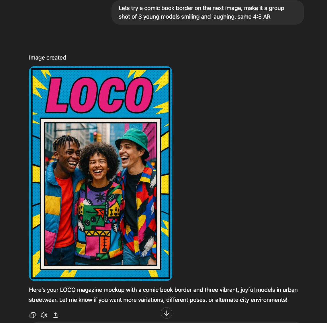
Let’s continue to further refine this aesthetic. We’ll stick with the comic book theme and try a monochrome background.
Followup Prompt:
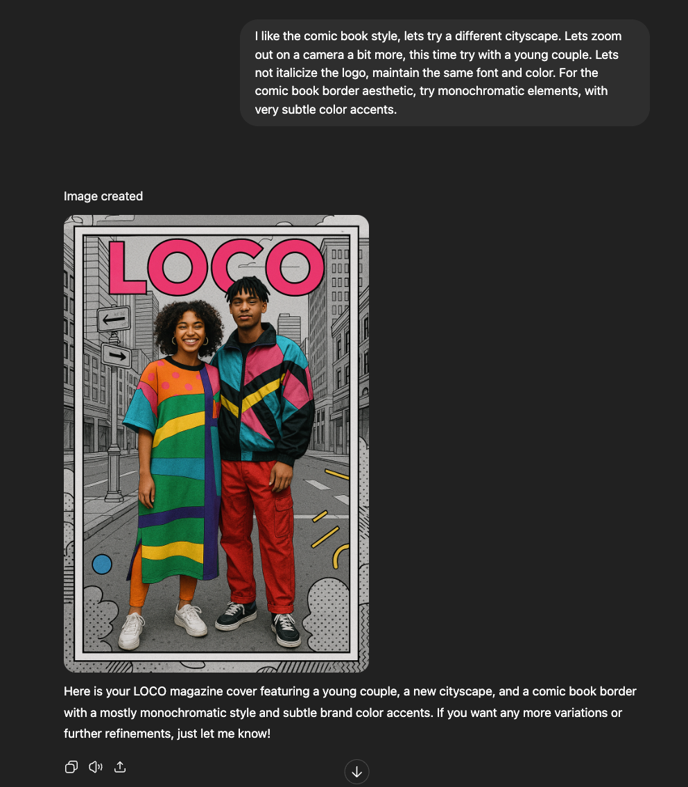
The monochromatic background really makes the colors pop.
Once you arrive at an aesthetic you like, ask it to generate images with different objects or backgrounds.
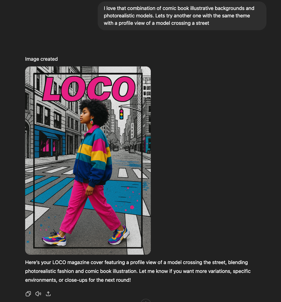
7. Isolate elements that you like
Once you’ve generated a library of mockups, look for standout elements you can use again and again.
This creates a toolkit of assets—unique backgrounds, logos, patterns, or icons—that help unify your brand everywhere you show up.
Why it matters:
These “building blocks” make it easy to maintain a cohesive brand identity, speed up your content creation, and develop consistent design for decks, social, email headers, and beyond.
The elements in an image generated by AI are not layered, hence not editable. When you have layers, you can add or modify elements individually like your logo, overlay pictures etc.
How to do it:
- Review the Mockups created by the AI and identify elements you’d like to preserve, for Ex: backgrounds and environments.
- Use editing tools:
- Isolate or crop out the element you want (using Photoshop, Canva, Figma, or free tools).
- Save as transparent PNG or SVG:
We want to re-use the monochromatic cityscapes as a part of our signature style, so we used Canva’s “Magic eraser” tool, to remove the foreground elements and just preserve the city background as a branding asset.
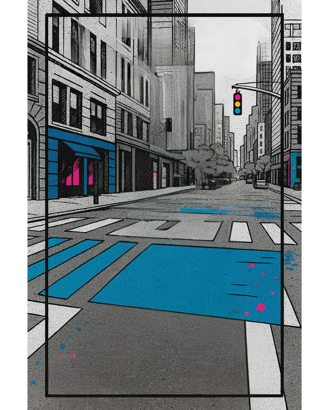
We then used this image as a reference and asked ChatGPT to create other similar backgrounds to have variations for our branding assets.
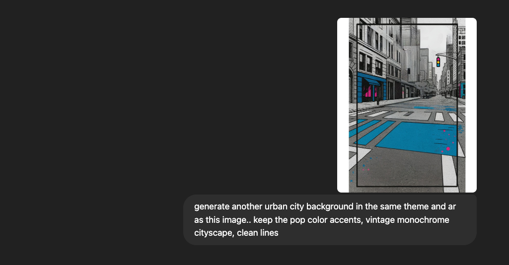
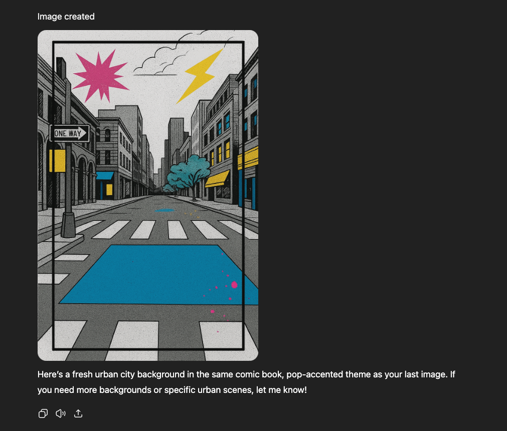
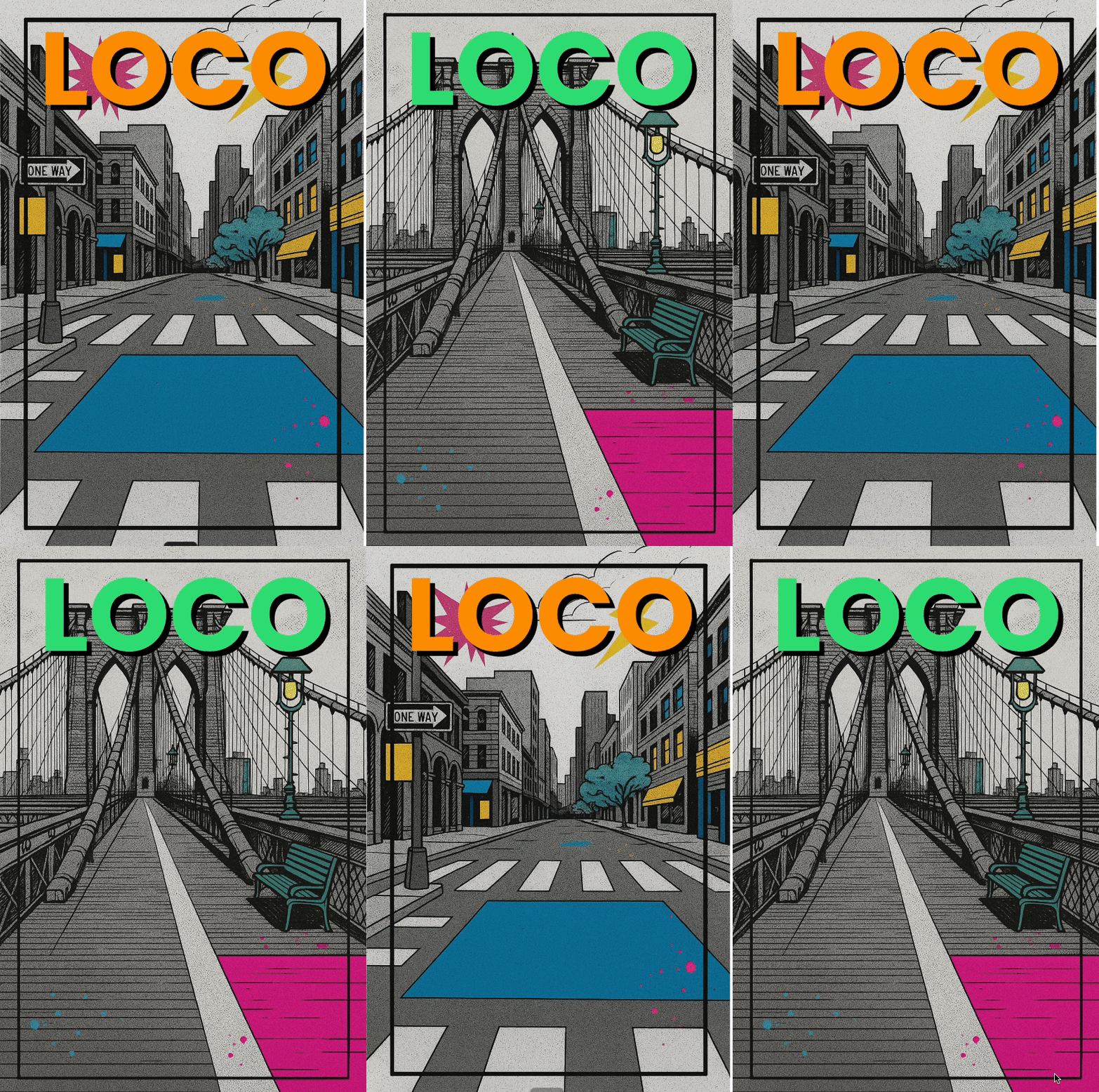
We generated a few more background images and loaded them into a Canva project.
We added the Logo in text format using the Poppins font with a shadow effect. We used the same neon colors ChatGPT suggested for our style guide.
Now we have re-usable branding assets that can be combined with real pictures, more illustrations or even different logo designs.
Wrapping Up: The Human Touch
AI can unlock an endless stream of creative options—but you are the curator, editor, and storyteller behind your brand. The most memorable visual identities come from a clear vision, intentional choices, and a willingness to experiment and evolve.
Best Practices & Tips:
- Start with clarity. Let your vision and values guide every creative decision—Lead with feeling and work your way into building reusable assets.
- Iterate openly. Think of your first images as drafts, not finals. Test, tweak, and ask for feedback before settling on your “signature” style.
- Embrace happy accidents. Sometimes, the best branding ideas come from unexpected results. If something resonates, make it part of your system.
- Stay consistent (but flexible). Document your rules, but allow your style to evolve as your brand grows.
- Preserve the consistent assets. Build a library of reusable elements—backgrounds, icons, frames—that speed up your design process and unify your presence.
- Experiment freely. Where you arrive might be completely different from where you began. You will surely find usable concepts and elements along the way.
Above all, don’t be afraid to put your personal stamp on your brand. The magic happens where technology and your creative voice meet.
Knowledge Check
1 / 5What is the very first step recommended before touching any design tools or AI when building a brand look and feel?